Candlestick charts are an essential tool for traders and investors in the financial markets. They help to visualise the price movements of an asset, which can be used to identify patterns and trends. In this article, we will explore the basics of candlestick charts, the different types of candlestick chart patterns, and how to perform a deep analysis of candlestick charts.
What exactly are Candlestick Charts?
Candlestick charts are a type of financial chart used to represent the price movements of an asset, such as stocks, currencies, or commodities. They display the open, high, low, and closing prices of the asset for a specific time period, which is typically daily, weekly, or monthly.
The chart is made up of a series of candles, with each candle representing the price movement over a specific time period. The body of the candlestick represents the opening and closing prices, while the upper and lower shadows, or wicks, represent the high and low prices. Candlestick charts provide a quick and easy way to visualise price movements, making them a popular tool among traders and investors.
Different Parts of Candlesticks
Each candlestick has four parts, the open, the high, the low, and the close. The body of the candlestick represents the open and close prices, while the upper and lower shadows represent the high and low prices.
The colour of the candlestick body represents whether the asset’s price closed higher or lower than its opening price. A green or white candlestick indicates a bullish or positive trend, while a red or black candlestick indicates a bearish or negative trend.
Candlestick charts work by displaying the open, high, low, and closing price of an asset for a specific time period. Each candlestick on the chart represents a specific time period, such as 1 minute, 5 minutes, 15 minutes, or a day. The body of the candlestick represents the opening and closing price of the asset, while the upper and lower wicks represent the high and low prices for that period.
The colour of the candlestick represents the price movement of the asset during that time period. If the closing price is higher than the opening price, the candlestick is typically coloured green or white, indicating a bullish or positive price movement. If the closing price is lower than the opening price, the candlestick is typically coloured red or black, indicating a bearish or negative price movement. Traders use candlestick charts to identify patterns and trends in the price movements of an asset. By analysing the different patterns formed by the candlesticks, traders can identify potential trading opportunities and make informed trading decisions.
Candlestick charts are also used in conjunction with other technical analysis tools, such as trend lines, moving averages, and volume indicators. By combining these different tools, traders can get a more comprehensive understanding of the price movements of an asset and make better-informed trading decisions.
Types of Candlestick Chart Patterns:
Candlestick charts have various patterns that traders use to analyse market trends and make trading decisions. These patterns can be classified into two categories: reversal patterns and continuation patterns. Reversal patterns indicate a change in the trend, while continuation patterns indicate that the trend will continue.
Some of the common patterns include:
- Doji:This pattern occurs when the opening and closing prices are close to each other, resulting in a small body with long shadows. It indicates indecision in the market and can signal a potential reversal.
- Hammer: This pattern has a small body and a long lower shadow. It indicates a potential reversal in a downtrend.

- Hanging man:This pattern has a small body and a long lower shadow, but it occurs in an uptrend. It indicates a potential reversal.
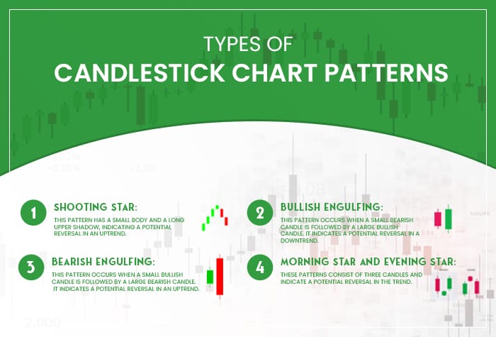
- Shooting star:This pattern has a small body and a long upper shadow, indicating a potential reversal in an uptrend.
- Bullish engulfing:This pattern occurs when a small bearish candle is followed by a large bullish candle. It indicates a potential reversal in a downtrend.
- Bearish engulfing: This pattern occurs when a small bullish candle is followed by a large bearish candle. It indicates a potential reversal in an uptrend.
- Morning star and evening star:These patterns consist of three candles and indicate a potential reversal in the trend.
Deep Analysis of Candlestick Charts
Deep analysis of candlestick charts involves using various technical indicators and strategies to interpret the patterns and identify potential trading opportunities. Technical analysis is the process of using charts and other tools to study the historical price movements of an asset to predict future price movements.
There are several technical indicators that traders use to analyse candlestick charts, including moving averages, trend lines, support and resistance levels, and volume indicators. These indicators can help traders identify trends, support and resistance levels, and potential entry and exit points. Moving averages are one of the most popular indicators used in candlestick analysis. They are used to identify the trend of an asset by smoothing out the price data over a specific period. A moving average is calculated by averaging the price of an asset over a specific time period, such as 10 or 50 or 200 days. Traders often use the crossover of different moving averages as a signal to enter or exit a trade.
Trend lines are another popular tool used in technical analysis. They are used to identify the trend of an asset by drawing a line connecting the highs or lows of the candlestick chart. An uptrend line is drawn by connecting the lows of the candlestick chart, while a downtrend line is drawn by connecting the highs. Support and resistance levels are important levels that traders use to identify potential entry and exit points. A support level is a level where the price of an asset has historically found support and bounced back up, while a resistance level is a level where the price of an asset has historically found resistance and pulled back down.
Volume indicators are used to analyse the trading volume of an asset. High volume can indicate that there is strong market participation and a potential trend reversal or continuation. Traders often use volume indicators in conjunction with candlestick chart patterns to confirm their trading decisions.
Also Read: Swing Trading 101: A Beginner’s Guide to Riding Market Trends
Conclusion
In conclusion, candlestick charts are a powerful tool for traders and investors to analyse the price movements of an asset. By understanding the different types of candlestick chart patterns and using technical analysis, traders can identify potential trading opportunities and make informed trading decisions. As with any trading strategy, it is important to perform thorough research and analysis before making any trading decisions.
A candlestick chart is a visual tool used in trading to represent price movements over time. It’s essential for traders because it provides insights into market sentiment, helping identify potential trends and reversals with clarity.
Start by understanding the candlestick’s body (price range between open and close) and wicks (highs and lows). Green or white candles indicate price increases, while red or black candles show decreases. Focus on patterns and trends to make informed decisions.
Popular patterns include Doji (indecision), Hammer (potential reversal), and Engulfing (trend reversal). These patterns help traders predict market movements and make strategic entry or exit decisions.
Candlestick charts are highly effective when combined with other technical tools. While they provide valuable insights, accuracy depends on market conditions, timeframe, and the trader’s ability to interpret patterns correctly.
Avoid relying solely on single candlestick patterns, ignoring volume or market context, and overtrading based on short-term signals. Always use candlestick analysis alongside other indicators for better accuracy.
Yes, candlestick charts are versatile and can be used for stocks, forex, commodities, and cryptocurrencies. They are effective across various timeframes, from day trading to long-term investing.


